Is your life a giant bag of screwups, fuckups, near misses, unrealized dreams, cancelled holidays, unexpected diagnoses, strained relationships, complete misunderstandings and crazy accidents?

Terrific!

Good friends die, enemies prosper, children grow up and blame you for their misfortune?

Marvelous!

Your marriage is dull and/or the single life is wanting, the cocktail parties are full of idiots, that lottery ticket is never the big winner, the thousand dollar mattress promising you restful sleep didn’t deliver, and your self-discipline vanishes every time you see a doughnut wearing a chocolate glaze?

Wonderful!

ChatGPT4 and the rest of the AI bandwagon is coming for your job, your paycheck, your identity and your dignity?

Superb!

Why is all this aggravation such stupendous news? Because you have arrived at the place of understanding that life is simply absurd. And you’re trapped like a rat in it. Unless, of course, you decide to take the next exit to nonexistence, which is always an option.

But if you decide to hang around, you’re now presented with what a beard-stroking psychologist would call “an opportunity for growth.”

To that end, we are not only pleased to point you towards the Class 2 philosophy known as SuperOptimism, we also want to credit our friend Albert Camus with penning the definitive treatise on such unpleasantness.

According to Al, you have three choices:

  1. Believe in God and spend your time praying to be let into the gates of heaven.
  2. Commit suicide.
  3. Embrace the absurdity of existence and enjoy rolling your rock up the hill.

Camus encourages us to choose Door #3, and find happiness in our struggle by acknowledging its futility and thereby defying the gods. So why not join Albert in smiling at the ridiculousness of it all?*

* Especially if you wish you were a world-renowned poet but instead spend most of  your time writing promotional copy for a chain of fast-casual restaurants.


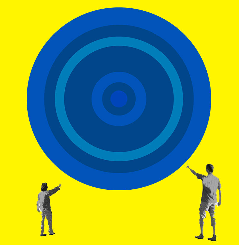
Where does art get made? In the mind of the artist? Or in the experience of the viewer?

Cultural critics developing “reception theory” started asking those questions in the 1960s. It was part of a philosophical project to understand how humans make meaning from the objects they see. How do we process what we see in the world and make sense of it?

For example, an artist has a specific idea in mind to paint a red apple. If the artist paints the apple realistically the resulting painting is called “art.” The artist made art by converting an idea, a mental image, into a real object made of paint.

Next, a viewer comes into a gallery and sees that apple painting, and in the viewer’s brain, there is a jolt of mental recognition. The viewer’s brain goes: “Ah-ha! I see an apple. I understand what the artist is telling me. There is an apple. It is red.”

There are two important art moments:

One: An artist conceives of art in the artist’s brain.

Two: the viewer makes meaning of art in the receptive brain.

Reception theorists argue that the “art moment” is really when the viewer sees the work. That is when the art is activated and the viewer translates it to real, actual, lived experience.

Suppose you lock a painting in a vault where no one can see it. Is the painting still functioning as “art?” A book without a reader is pointless. A movie without a spectator is just flickering light. Without the active viewer response, no meaning is made and no art exists.

I know what you’re thinking:

“This reception theory is philosophical bullshit. Only the artist makes art. Duh.”

But another way to think is that “art” exists in the active process of physically making art. Art equals process. This is literally correct in art forms with a temporal basis, like ballet and other forms of dance. The skillful performance of music equals art. If the violinist stops playing, the art stops. There are some painters and sculptors that see their work as a performance and the physical results are a “recording.”

But consider again the rather bold idea of reception theorists:

What if the viewer is more important than the maker? That radical idea shifts power from the maker to the consumer. The shift makes a lot of sense in our consumer-driven commercial culture. Right now, you can be a wonderful traditionally skilled artist-maker, but if you don’t connect with a receptive commercial audience you’ll starve. Reception is important.

And does it really matter who makes the art?

<iframe id=”reddit-embed” src=”https://www.redditmedia.com/r/Damnthatsinteresting/comments/100r3mx/human_evolution_generated_by_ai/?ref_source=embed&amp;ref=share&amp;embed=true” sandbox=”allow-scripts allow-same-origin allow-popups” style=”border: none;” height=”621″ width=”640″ scrolling=”no”></iframe>

Is honoring the maker just a nod to ego and the celebrity of fame-culture enjoyed by name artists of high reputation? In that case, “art” has become about treating artists as name brands and there is a scant difference between the name-brand paintings of Odd Nerdrum and the name-brand shoes by NIKE. The shift makes art a commercial product with easy hooks for the audience to understand why they should buy “X.”

And now we come to the latest development, the issue of AI programs creating art. There are anxious questions about AI art: Is AI stealing from the true human makers? Who is actually making the AI art? Where does it come from? Is AI stealing source images? Or is the real maker the coder who created the architecture and designed the AI software? With AI art, it’s hard to pinpoint who and what made the art, and where it came from. AI art seems to form magically, pulled from the void by typing an incantation of a few words online. We are given a new power, but we are not given an understanding of how the hidden AI magic works. This is scary.

A reception theorist would say AI art is 100% legitimate art because it only requires a viewer to see it and understand it as art. That’s it. The art reaction is made in the mind of a viewer and it doesn’t matter if the art is made by a person, or by AI software.

Pigs, dogs, and dolphins have been taught to hold a brush and paint what they see. Some viewers see the work as art. Is this real art? Reception theory would say: yes it is art — if you see it that way.

The upsetting thing about AI art is that it challenges human ego, vanity, and hubris. We got pretty smug when we were competing with dogs at painting. Humans are obviously better, more dexterous painters than any elephant. We humans can feel good about our superiority over the animal world. But AI is a lot more skillful and learns faster than an elephant, which is scary. AI looks like it could be much better at providing art to viewers than the slow, lazy old human artists. AI removes our special status as the only animals with divine inspiration to make magically good art. And that hurts.

What day of the year combines haggis, whisky and poetry? Why, it’s “Burns Night,” the January 25th celebration of the poet Robert Burns’ birth. Many mark the occasion by attending a Burns’ Supper, a night that includes a tasty meal, performances of Burns’ work and a speech in honor of the great Scottish Bard. To throw your own Burns’ Supper, here are suggestions for the order of events:

Once everyone has arrived, the host should say a few words of welcome. Then everyone sits and Burns’ Selkirk Grace is said:

Some Folk hae meat that canna eat,

And some can eat that want it;

But we hae meat, and we can eat,

So let the Lord be Thanket!

Following grace, the appetizer is served and the haggis is piped in. In case you’re not familiar with the Scottish dish, haggis is a pudding containing sheep’s heart, lungs and liver, minced with onion, oatmeal, suet, spices, and salt, mixed with stock, and cooked while traditionally encased in the animal’s stomach.

The host performs the famous Burns Night poem Address to a Haggis, everyone toasts the haggis and the main meal is served, followed by dessert.

After dinner, the first Burns recital is performed, then the main tribute speech to Burns is given, referred to as “The Immortal Memory.” Afterwards, a second Burns recital is performed. And let’s not forget the “Toast to the Lassies,” followed by a “Reply to the Toast to the Lassies,” before the final Burns recital is performed.

At the end of the evening, the host thanks everyone for attending, and then “Auld Lang Syne” is sung, hands joined at the line “And there’s a hand, my trusty fere!.”

And should you wish to memorize a few stanzas of Burns for the big night, you could do worse than Holden Caulfield’s favorite, “Comin Thro’ the Rye.”

Comin thro’ the rye, poor body,
     Comin thro’ the rye,
She draigl’t a’ her petticoatie
     Comin thro’ the rye.
[CHORUS.]
          Oh Jenny ‘s a’ weet poor body
               Jenny ‘s seldom dry,
          She draigl’t a’ her petticoatie
               Comin thro’ the rye.
Gin a body meet a body
     Comin thro’ the rye,
Gin a body kiss a body —
     Need a body cry.
          Oh Jenny ‘s a’ weet, &c.
Gin a body meet a body
     Comin thro’ the glen;
Gin a body kiss a body —
     Need the warld ken!
          Oh Jenny ‘s a’ weet, &c.
[Second Setting]
Gin a body meet a body, comin thro’ the rye,
Gin a body kiss a body, need a body cry;
Ilka body has a body, ne’er a ane hae I;
But a’ the lads they loe me, and what the waur am I.
Gin a body meet a body, comin frae the well,
Gin a body kiss a body, need a body tell;
Ilka body has a body, ne’er a ane hae I,
But a the lads they loe me, and what the waur am I.
Gin a body meet a body, comin frae the town,
Gin a body kiss a body, need a body gloom;
Ilka Jenny has her Jockey, ne’er a ane hae I,
But a’ the lads they loe me, and what the waur am I.
There’s a thing in the social sciences called the Matthew effect of accumulated advantage. The Matthew effect is sometimes summarized by the adage “the rich get richer and the poor get poorer.” In the creative arts, you might say “the famous get ultra-famous and the overlooked become invisible.”
Fame comes as a byproduct of success. A filmmaker like Peter Jackson experimented with many genres from comedy to horror. But once he found massive success with Lord Of The Rings it led to fame. And once you get labeled a famous creative genius in our culture, your opportunities are essentially unlimited.
So how do you get that massive success? Writing in the journal NATURE, social scientists recently evaluated creativity across the careers of top-performing artistic, scientific, and cultural figures.
What the scientists discovered as a common feature of these careers is “hot streaks.” A hot streak is when a creative person makes some original, novel, surprising artworks that are spectacularly well-received. The art gets attention, it gets awards, a lot of money changes hands. For the artist, a major career impact, more money, more opportunity.
Hot streaks are not about luck. They are a result of two things. First, a large volume of work needs to be produced to develop a personal sense of craft. Second, a lot of experimentation has to take place to arrive at a unique personal aesthetic that “works.” Both factors are required to discover a hot streak.
If you are a fine arts painter, you can’t decide to do one painting and call it a hot streak. You also can’t continue to produce hundreds of stylistically identical images year after year and hope for a hot streak to come. Because hot streaks arise from experimentation, development, risk-taking, and exploration. You won’t find a hot streak by following a venerable established recipe.
This can be a problem because 97% of traditional fine arts training in skill-building is about learning tools, following recipes, knowing historical styles, and seeing patterns. There is very little guidance into experimentation, risk-taking, or how to think about failure in most educational art settings. Students crave a formula for a successful result. They don’t want a messy failure. And yet a messy failure may be the only way forward to a personal style that does not look exactly like every other artist’s skillfully rendered bowl of fruit.
A great example of experimentation is Picasso. Picasso started with traditional skills, and his precise pencil torsos from 1892 look like ordinary academic studio work. By 1897 he was drifting from staid realism to symbolism. In 1901 he entered a three-year “blue period” doing works in shades of blue and green. His two-year “rose period” followed to 1906. Then came a period of African art and primitivism. In the next decades, he explored analytic cubism, synthetic cubism, and surrealism. Was all the work great art? No. But the volume of experimentation created “hot streaks” of highly original work that led to fame and success.
Maybe you are not a dynamic creative genius like Picasso driven to constantly explore new approaches. But if your work is unsatisfying, the solution is not to keep repeating a failed recipe in hopes that one day the burnt cake will eventually taste good.
This tendency for artists to continue making work that nobody likes can be attributed to the “ego effect.” The ego effect suggests that you’re prone to making the same mistakes over and over again when you protect your beliefs instead of learning from your mistakes and changing your beliefs in response to conflicting evidence. I’ve seen this in art when a painter makes a painting nobody likes (not even the maker) and yet they continue to generate more similarly unlikable art because it is the style they have invested the most time practicing.
Difficulty in making a creative course change is sometimes called “target fixation.” Target fixation occurs when an individual becomes so focused on one thing that they exclude other factors to their potential detriment. For example, a painter becomes so fixated on being able to paint a vase of flowers in the admirable style of Henri Fantin-Latour (1836 – 1904) that they fail to see the bigger picture. Learning to perfectly emulate that retro-classical style may be irrelevant today.
Changing any behavior or habit requires both acknowledging there is a flaw in the current pattern and a willingness to commit to consistent, incremental, change. A bad habit, or consistently repeated error, can only be corrected by replacing the habit or pattern with a better one. And how do you know if your new pattern is better? This can only be discovered by personal experimentation and an open mind.
Do we need more bowl-of-fruit paintings? No. Please stop now. Reconsider your assumptions, and begin your personal experiments towards massive success.

These questions are developed in tandem with writer John Fox to help clarify any artist’s goals.

  1. What art subjects bring you to your knees?

So many artists avoid their true subjects. Perhaps they’re afraid to shine a light into the darkest corridors of their heart and paint what excites, obsesses, or terrifies them. But the only way to discover your true subject is to create freely, wildly, without a plan, and to see what subjects crop up repeatedly. What thoughts can’t you ignore? Many times people don’t want to show their inner obsessions, demons, or embarrassing pain. Because “odd thoughts” can appear as a personal weakness to stolid Americans. Don’t avoid the subjects that wound you – head directly for them. If you show us this kind of very personal subjects, we’re sure to be interested in seeing the results.

  1. Who are you drawing or painting for?

It’s presumed that artists only need to please themselves and follow their private North Star. But even if we agree that a please-yourself ego-driven approach is an OK way to approach art, you still need to be aware that your art will have a larger audience of viewers. If you are a normal human, you want a huge audience on Instagram that beams love at you. But to be a more effective communicator, you need to imagine and target a specific group of humans to connect with. It could be Cubans, Mormons, teenagers. And even if you do that targeting, aim yourself even further: Cuban designers in Miami, Mormons who own art galleries, short-attention-span teens that crave Day-Glo pop art. Even better, choose a single person and direct your art to them.

If you can’t imagine a specific person that will like your art — then the truth is nobody will like it much.

  1. Why are you painting?

Burn through the easy answers quickly:

  • Want to do something with my hands.
  • Want to make money and be famous.
  • Because you have something to say.
  • It’s the only job I could get.

Drill down to the true depths:

  • Because you want to express the unsaid.
  • You want to understand trauma you experienced.
  • Because someone told you that you couldn’t.
  • You want to see what kind of artist lives inside you.

Sometimes it takes years for you to realize that the reason you make art isn’t what you thought it was.

  1. What is the one thing you want to paint before you die?

Many people make art because they feel it’s marketable or because it’s popular or they enjoy copying what others do in imitative fashion. But what do you really want to say before you leave the planet? You better figure that out and paint that painting, because the one thing I can guarantee you is that you will be leaving, and maybe sooner than you’d ideally prefer. So get busy and leave us a masterpiece, OK?

Art shown above: Woman with a Coffee Pot by Paul Cezanne. Monsieur Cezanne obviously had an affinity for Arabica beans which he didn’t shy away from.

Hair is where painters show their biases towards design or nature, realism or abstraction. How a person paints hair reveals a lot about inner thinking and outer working process.

There are four main useful groupings revealing how artists think about hair (illustrated below.)

For some artists, especially painters coming from a background in illustration, hair is treated as a graphic design problem to solve. These artists seek ways to treat the tremendously complicated mass of hair as a simplified but intentional graphic design, often simplifying hair to strongly defined shapes and bold lines to execute hair as a graphic design. Examples include Picasso, Norman Rockwell, Lucian Freud, Jenny Saville, J.C. Leyendecker, Andy Wyeth, Ray Turner, Michael Borremans, and Olivia. This design-thinking is a very artistic approach but also a simple and minimalist mode, because illustrators need to get the job done and not spend hours fussing with hair. Once you have figured out a personal graphic-design way to interpret hair, the art can be done fast and effectively. But only after you know what graphic solution appeals to your taste.

A second way to think about hair is primarily as lighting falling on semi-solid forms. This kind of distillation approach asks the artist to do two things. First, get the shapes (or outline) correct. Paint the shape with the right color and value to indicate believable lighting, shadows, highlights. This idea requires extracting a precise simplification of what we see, reducing the visual data, but if it is done with sophistication and practice, the results are what we typically consider “a good painting.” A clue that an artist is thinking this way is they will avoid unnecessary small details and not be painting any more individual hairs than strictly necessary, and “none” is ideal. Examples are Justin Mortimer, Sargent, Sean Cheetham, and Sir Joshua Reynolds.

A mild step away from that way of thinking is artists that like to build in some limited areas of crisply defined, intense realist hair details. This can look quite good as shown by Cesar Santos, Golucho, or Odd Nerdrum. These artists paint the overall hair as a mass but also feel that adding single hairs, single strands, areas of detail, and clean edges gives a more compelling illusion. The idea works to a point — but can become a flawed compulsion because we all know that this is not the way we perceive hair in ordinary reality.

Really? How do we perceive hair?

Have you ever found yourself seated with another person and begun to microscopically study any single hair on their head? Or an errant nose hair? Have you counted the lush hairs in their eyebrows? No. It is a misconception to think that we perceive reality in high-definition and high-resolution. We don’t. It’s not how human eyes and brains work. Paintings that attempt this greater fine-grained resolution typically look flat, stiff, or odd, and artists wonder why it doesn’t look artistically great when they sweat to paint every last pore and hair.

A fourth approach paints hair the way it appears in photographs. This dominant photographic aesthetic has contaminated art and our brains to the point that we approve of a very mechanical optical result. Most painters working from photographs try to deny the potentially poisonous influence of photography and say it’s just a valuable source of realist detail. There’s nothing morally wrong with choosing photography as your aesthetic goal as a painter, though if that’s what looks good to you it would be a lot easier to just use a camera and the results will be even better at feeling like a photograph. And 5000 times faster to accomplish. That said, some people do the style very well like Gottfried Helnwein. Casey Baugh, Alyssa Monks, and Michael Sydney Moore.

It is not an uncommon circumstance that an artist will be invited to place a single painting in a group show or submit a single painting into a contest. Larger shows like the BP portrait competition get nearly 2,000 entries. At BP, the top 50 paintings get exhibited and four finalists are picked by tweedy British judges.

Is there any strategy you can use to help yourself psychologically or productively in this situation?

The big problem is that all your wonderful talent must be distilled down into this one painting. It alone represents you. No viewer is giving you extra credit for listening to your clever podcast talk or studying your dense sketchbooks. Judges can’t see the 573 paintings you did previously that got your talent where it stands. Nobody can see any of your tear-stained hard hours of lonely labor. The A+ you got from your beloved art teacher who set you on the path is invisible. All your good intentions for dolphins and trendy politically-informed ideas for radical justice are hidden from the viewer as well.

All we can see is the one painting you did.

BOOM!

GOOD OR BAD?

We are jolted awake or bored. Love it or walk on by. Sorry. “It didn’t work for me.” Or “I don’t like it.” Or “Who would hang that on their wall?”

Obviously, if award-winning painting strategies were easy, people would be grabbing awards like greedy children snapping up free chocolates. Actual winning strategies are few, but I will share four thoughts (and I welcome any comments if you have a good strategy I overlooked).

1) Do a lot of paintings. If you can only enter 1 painting in a show or contest and you only have 1 sad lonely painting in your studio you are severely limited at the outset. All paintings do not come out equally good and we all know this. Some remain failures no matter how hard you try to revive them. If you can challenge yourself to do the extra work and paint three, seven, or nine paintings for the contest and then select your best favorite one, you have already given yourself a huge advantage. Human nature tends to resist this approach because we are such lazy dull horrible beasts.

2) Figure out what wins before you start. This is a slightly corrupt strategy untrue to the higher realms of art but still a good cheat. If you look at the last twenty winners of the BP contest you can see a clear trend in the kind of subject, approach, and style that wins. At BP the judges will immediately look fondly on you if you paint a representational single figure soberly seated in a venerable chair.

3) Never paint an idea. Viewers respond to ideas slowly and poorly if at all because their brains are weak and seldom challenged. If you think you can win by painting about ecology, post-colonialism, or quantum physics it is an unlikely proposition. Winners paint “things” and ideally important things. Important painters paint important things like the pope, the queen, Elvis, Hitler, JFK, Stalin, and Marilyn Monroe. Painting a human being or the human form is always an advantage because the homo sapiens primate species is endlessly in love with watching itself.

4) Leverage what exists. If you are entering a show of floral paintings, pick an existing floral painting you like by Klimt, Monet, Haverman, or whoever floats your boat. Be willing to stand on the shoulders of dead art giants. No one will care if you try to flawlessly copy a vase by Matisse (I guarantee you can’t.) But take some inspiration and maybe even borrow some composition. This is the idea of starting from something already great. And you can never go wrong making “art about art” because that is the work that museum directors love best.

Seeking awards is a terrible reason to paint in any case, and can only be a sign of a fragile ego that seeks sustenance sipping from a golden cup filled with the milk of vanity. If you never win any damn award but your art fills you with deep private joy, this is the only true victory.

There’s a unique feature in visual art that’s easy to overlook. Artists frequently fail to recognize the deep power of the idea but it’s crucial to becoming the best artist you can be.

It’s simply this:

“Every attempt to make a single piece of art gives you information that can increase your chance of success in subsequent attempts to make art.”

So even if you make a drawing or a painting and it’s a total mess, a train-wreck, a failure, it’s filled with information that can guide your next attempt to be better. But only if you are honest with yourself and paying attention.

The people that really understand the power of this learning-from-failed-attempts concept are mountain climbers. Climber Reinhold Messner is among the best mountain climbers in the world, ascending peaks like K2, Everest, and Annapurna. More relevant is looking at all his failed efforts. Consider Makalu, the fifth-highest mountain in the world. Messner tried climbing Makalu four times. He failed in 1974 and failed in 1981 on the South Face. In winter 1985 he failed again on the North Face. In 1986 on a new route he also failed. But every failure informed the next attempt. Keep in mind that his attempts required a tortuous life-threatening climb above 8,000 feet in freezing conditions.

And how bad is it when a studio painting fails?

For climbers, analyzing what worked well and what went wrong is a matter of life and death. This is where climbers have a psychological advantage over painters. Every failed attempt to summit gets seriously analyzed down to the last detail of how many micrograms your climbing boots weigh.

But few artists scrutinize their completed painting with that same kind of intensity. Mostly, artists are relieved to be done the damn painting and happy to put a frame on it and get it out the door.

Yet painting offers a unique feature that does not apply to temporal long-form arts like writing novels or composing symphonies. You can make a painting and step back and quickly see in an instant (without a map or snow boots) how you are getting along. If you are analytical, the ability to recover from a mistake (paint it out, erase) is fast and you rarely need a helicopter rescue.

In painting, you can attempt an idea and if it fails, this is a great moment. Recognizing failure is crucial. That honest failure is loaded with information that can guide your next attempt at a better solution. And one of the biggest blocks to processing failure is when critics are too kind and generous and offer faint praise or polite smiles. And then the artist thinks: “Gee, I guess this is good enough.”

Your biggest job as an artist is deciding which information in your failed attempt is important. Why does it look so bad? Did you go wrong in composition? In color? A silly idea? Cliché? Too dark? A weak drawing? Identifying problems and coming up with creative solutions and alternatives — this is essential in making your “map” for a successful ascent, and it’s not the same for every artist.

Admit failure. Embrace failure. Extract useful information. Make a better plan. Try again via a different route.

Artists should never feel bad about failed attempts or disappointing results. These are gold mines of information and ripe opportunities for improvement. Brave failed attempts may be the only way to truly improve. You just have to pay attention and read the mountain. Stop trying to ice climb in the worst snows of winter. There are always better alternate routes to the top, right? Find your way.

We’re particularly impressed by the powerful and iconic paintings of the artist Haddon Hubbard “Sunny” Sundblom (June 22, 1899 – March 10, 1976.) This stuff is brilliantly painted and aims an artistic arrow into the heart of Americana. We’ve done some research into exactly how he approached oil painting and we share it with you here:

When painting, Sundblom would work from dark to light, and thin to thick, utilizing a wet-into-wet (or ala prima) approach in laying down heavily loaded strokes of color. This technique of working while the oil was still wet allowed Sundblom to complete many of his illustrations in only one or two sittings. He was a remarkably fast painter, and his speed helped him to maintain a sense of freshness and spontaneity in his work. When Sundblom first sat down to consider a picture, he would start by making loose, rough sketches.

According to Harry Ekman, an artist who worked with Sundblom in the late ’50s, “He would sit down, and roughly—I mean quite roughly, sometimes on monogrammed stationery—make very abstract sketches. You could recognize some substance to the doodles, but they were mostly value sketches. He would make many of those and just keep going until he got an idea. Then he’d call in his models and take photos. When he started out he used models and worked from life, but by the ’30s, ’40s, and ’50s, you’d have to pay $30 to $50 an hour for models, so it became prohibitively expensive.”

Not surprisingly, Sundblom often used his neighbors, colleagues, and three young daughters as stand-ins for many of his illustrations. After taking the black and white reference photos, he would make a quick but highly accurate charcoal drawing on his canvas, and seal it by fluffing pumice across its surface, blowing ethereal varnish or shellac on the board with a spray atomizer. Unlike some other illustrators, Sundblom only used the photos for a reference, never trying to copy the actual look of the photograph. Sundblom very rarely used a Balopticon projector, as many other illustration artists of the day were doing to save time.

“He believed that if you were doing an illustration for a story, you should enhance the story. You should always add to it,” Ekman said. His goal was iconic powerful images and copying photography alone would never deliver the iconic power he sought.

Alexander Kortner, an illustrator and protege of Sundblom’s, said, “He was a terrific draftsman in his own right. He would first make a sketch from nothing, just out of his head. Then he would use some reference photos to construct his drawings on canvas with charcoal. He very seldom used a Balopticon, and he never stayed too close to the reference photos. He drew with the brush as he painted. His drawing on canvas was never very detailed, but it was beautiful in and of itself.”

Then he would start in painting, and it was miraculous the way he mixed colors from a rather ordinary palette of 12 tube colors and his only medium was turpentine. Few people ever actually saw him paint, but I did,” Kortner said. “He would start with big bristle brushes and rough in the whole thing in an hour or two. He was very, very fast. It’s surprising how much he could do with a big brush. in a demonstration for an artist’s group in Chicago, he’d make a painting in about an hour and a half at the most, and it’s a beautiful thing. At the end of the demo, they would raffle it off to whoever was there. He didn’t do demonstrations too often because he wasn’t fond of it, but he would do them occasionally for the Chicago Artist’s Guild. He would start with a raw canvas and start right in. Some of the best illustrators in the city would come to the demonstrations just to watch him work.”

If you want to try to work in the Sundblom style, one of the best ways to modify your current habits and be more Sundblom-esque may be to set a 60-minute timer while you paint. Try to force yourself to work faster than you normally do. Don’t be fussy or precious but strive for accuracy and efficiency. Get that idea down in paint! Remember, the client expects your great iconic art done by tomorrow. Better get moving


Note: Over the next few weeks, The SuperOptimist will be providing a series of experiments one can conduct on themselves at home. They are designed for the curious, the seekers of experience, and those who wish to pass the time in novel and thought-provoking ways. 

While biding your time in your own personal quarantine, the walls can feel like they’re closing in.

But maybe it’s not the walls — it’s the color.

Color can play a big role in your mood. So when SuperOptimists get a bit squirrelly, we stare at the color blue. It’s a scientific fact that blue makes you feel safe and relaxed, and no wonder. It actually causes the body to create chemicals that are calming. When you marvel at the ocean, it’s not just the waves that mesmerize. Same with the sky.

Which color blue appeals to you? Here’s a few shades to consider:

Blue does such a good job in calming the mind, that after blue lights were installed at Japanese transit stations, there was an 84% decrease in the number of people jumping in front of trains. There was a similar decline in the number of violent crimes when streetlights were converted to blue in Scotland.

So if you’re getting a little edgy wondering whether you’ll be sequestered until 2021, a simple change of light bulbs in a room can transform your crib into a virtual sea of calm.

Then again, pink may be an even better choice. After all, as we are now in our self-imposed prisons, we might take our cue from actual prison wardens who paint holding cells pink. They were inspired by studies conducted by research scientist Alexander Schauss, who created “Baker-Miller Pink” and showed it to reduce criminals’ hostile behavior, although later tests proved inconclusive. The color is also referred to as “Drunk Tank Pink” and inspired an interesting book on how our environments shape our thinking.

In 2017, model Kendall Jenner painted her living room Baker-Miller Pink – and raved about how it made her feel calmer and act as a diet aid.

“Baker-Miller Pink is the only color scientifically proven to calm you AND suppress your appetite. I was like, “I NEED this color in my house!” I then found someone to paint the room and now I’m loving it!”. Want to walk a mile in Kendall’s puffy slippers? Here’s a bucket for you.

*It is important to note that one person’s blue might be another person’s chartreuse. Colors can be subjective, depending on the viewers’ past experiences or cultural differences. So we advise you to experiment with color to find the shade that puts you in the desired state of mind.

**It wasn’t that long ago when little girls were dressed in blue and boys in pink. But this reversed during the middle of last century. While the shift was apparently the result of clothing designers’ tastes, some attribute it to Nazi Germany forcing gay men to wear a pink badge when grouping them as undesirables, thereby tainting the color as “non-masculine” going forward.